
Why Charm Hush Textured Script Is Perfect for Elegant Branding
Looking for a font that feels both handcrafted and refined? Charm Hush Textured Script blends organic texture with elegant styling, making it a strong choice for brands that want to feel premium, warm, and human.
In this guide, you’ll learn how to use Charm Hush for elegant branding, including practical examples, font pairing tips, and accessibility-friendly design advice for your website and visual identity.
How to Use Font Charm Hush Textured Script
Use It for Headlines, Logos, and Display Text
Charm Hush works best at larger sizes, where its texture and letter details can stand out clearly. It is ideal for:
Logo design.
Hero section headlines.
Section titles.
Packaging labels.
Invitation titles.
Social media graphics.
For body text, choose a simpler font to keep your layout easy to read.
Pair It with a Simple Secondary Font
The best typography uses contrast. Since Charm Hush has a decorative script style, pair it with a clean sans serif for balance and readability.
Use no more than two fonts in one design so your branding stays clean and consistent.
Keep Accessibility in Mind
Readable design matters. To make your text easier to use across devices and screen sizes:
Keep contrast high between text and background.
Use at least a 4.5:1 contrast ratio for normal text.
Try dark charcoal text on a soft cream background for a warm, elegant look.
Avoid placing thin script text over busy images or colorful patterns.
Real-World Example: Charm Hush in Action
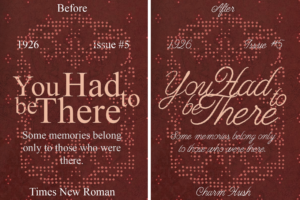
This simple change can instantly make a design feel more artistic, emotional, and premium. The textured script adds personality, while the right supporting font keeps the layout clear and balanced.