
Choosing a font in 2026 can feel overwhelming.
There are thousands of typefaces out there, new ones released every week, and now even AI can generate fonts in seconds. But with all that abundance, many brands end up looking… the same.
At Setara Langit Creative, we believe a font is more than just a design choice.
It’s the voice of your brand. It’s how your brand speaks before it says a single word.
So instead of asking, “What font is trending right now? ”
We prefer to ask : “What kind of story do you want your brand to tell? ”
1. Start with your brand’s personality
Before browsing any font library, pause for a moment. Imagine your brand as a person. How would it talk? Is it soft and warm? Bold and confident? Calm and poetic? Playful and expressive? Your answers here matter more than any trend. In 2026, strong brands are not built on aesthetics alone, but on identity. A beautiful font that doesn’t match your personality will always feel off, even if people can’t explain why.
2. Why handcrafted fonts feel more relevant than ever
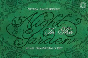
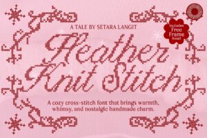
We live in a very digital world. Everything is fast, clean, automated, and optimized. That’s exactly why handcrafted and vintage-inspired fonts feel so powerful today. They bring back:Human touch, Imperfection, Emotion, & A sense of story. Slightly uneven strokes, organic curves, and classic details make a brand feel more real. More personal. Less “generated”.
This is why handcrafted typography works beautifully for brands in:lifestyle & wellness, fashion and beauty, creative studios, coffee, bakery, and artisan products. They don’t feel mass-produced. They feel crafted with care.
3. But beauty alone is not enough
Here’s something we’re always honest about with our clients and customers. A font can be very artistic and still be a bad brand font. If people struggle to read it, your message is lost. If it only works in a logo but fails on a website, it becomes a problem.
That’s why we love combining: Expressive, handcrafted fonts for headlines and logos with Clean, editorial fonts for body text. This balance gives you:emotion and character clarity and readability. In other words : soul + structure. And in 2026, that balance is everything.
4. Vintage doesn’t mean outdated
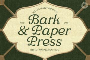
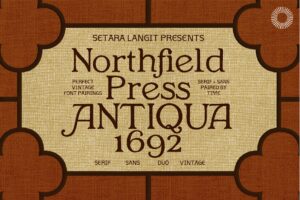
Many people think “vintage ” means old-fashioned. But We see it differently. Vintage style today is about:timeless forms, classic proportions, inspiration from print, calligraphy, and craft. Of course, Not copying the past, but honoring it. A good vintage-inspired font doesn’t make your brand look old. It makes your brand feel rooted, thoughtful, and intentional.
And that kind of feeling never goes out of style.
5. Think in systems, not just one font
Your brand doesn’t live in one place anymore. It lives on :your website, social media, packaging, presentations, digital products
That’s why choosing just one font is rarely enough. We always recommend thinking in a small system :one main font for expression & identity, one supporting font for reading & structure. This keeps your brand consistent, flexible, and scalable as it grows.
6. Test your font in real life
Before committing to a font, try using it in real situations:your logo, a website headline, an Instagram post, a paragraph of text. Ask yourself :Does it feel like “me ”? Is it easy to read? Does it fit my audience and price point? A good font is not just pretty on a preview image. It should work in the everyday life of your brand.
7. Our perspective on typography in 2026
From what we see in the design world, the direction is clear. Brands are moving away from:generic templates, overly perfect AI design, trend-chasing visuals
And moving toward :human design, handcrafted details, editorial balance, emotional storytelling. People don’t want brands that look perfect. They want brands that feel real.
8. Final thoughts
Choosing the perfect font in 2026 is not about finding the “best ” typeface. It’s about finding the one that :reflects your brand’s soul, communicates clearly, feels human in a digital world
A great font doesn’t just decorate your brand.
It becomes the way your brand speaks, feels, and is remembered.
One Comment
Anggini
I love the way this article explains typography in a human and emotional way. It made me rethink fonts as part of brand identity, not just decoration. I just wish there was a simple step-by-step checklist at the end to help apply this in practice. ”